InFlux Winner:
Best in Show in Identity / Best in Show in Packaging
I worked solely on this project. This project includes:
UX, UI, Branding, Activation, Web Design, Social Integration
overview
An alcohol nearly always poured with a mixer, vodka isn’t meant to sip on. Deadly Vodka has positioned this spirit as a catalyst for the party and embraced the sin which follows.
The design was influenced by the seven deadly sins and Dante Alighieri’s Inferno. The brand’s slogan, “It is pleasure and not necessity that compels us,” is a quote from the book with a Deadly Vodka twist.
The hellish hurricane, which never rests, drives on the spirits with its violence.
—Dante Alighieri, Inferno
the challenge
This company is creating a vodka meant for partying. How do we show that our product is fun, exciting, and worth trying?
Our goal is to drive engagements through an activation on the landing page and #deadlydare, as well as increase the brand awareness by 20%.
DEMOGRAPHICS RESEARCH
We conducted surveys to gather information on our ideal users. They are men and women aged 21 – 44 with moderate disposable income. They should have an interest in drinking and partying. They should be more adventurous with their alcoholic beverages. Deadly Vodka is not targeting “sophisticated drinkers,” but rather the wild crowd.
In the surveys, 91% of my interviewees stated they do not “sip/slowly drink” vodka. 67% stated they prefer vodka with a mixer and 24% preferred drinking vodka as a shot.
“I don’t know if I’ve ever had vodka without cranberry juice or soda.”
“I only drink vodka if I’m trying to get drunk.”
“Vodka usually tastes like nail polish remover.”
Going in, I knew that it should be clear that:
The brand positions itself as the catalyst for a wild time, not refined sipping
Deadly Vodka is a party drink
Deadly Vodka is flavored, not plain
persona
Fun, Bold, Free-Spirited
Bio
30 years old, lives in San Antonio, TX. Is a sales associate. Makes $65,000. Likes going to clubs, thrift shopping, painting, and discovering new music.
Wants & Needs
To discover a new experience with drinking; something different from the typical vodka soda he gets every weekend. Wants to be loyal to brands with a strong personality.
Pain Points
Is disappointed when he can’t figure out where to purchase new brands near him. Hates having to research new brands through boring liquor wholesale sites.
flavors
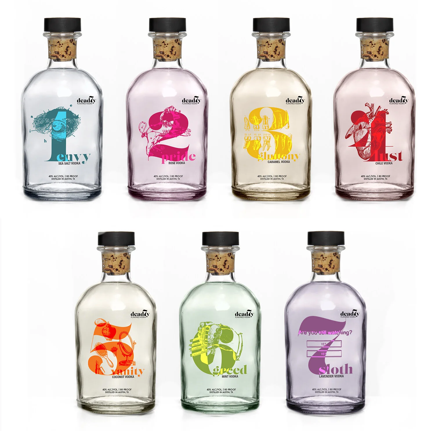
1. envy/sea salt
For centuries, tasting salt has equated to a sense of suffering. Just ignore your neighbor's envy when they mean mug you going out on a Tuesday night.
2. pride/rose
No flower has been celebrated as much as the rose. Much like a pride of lions, you and your posse wear smug satisfaction on your face as you sip on this vodka.
3. gluttony/caramel
Sugar and butter: the ingredients required to make caramel. It's just pure gluttonous ingredients. Candy is dandy, but liquor is quicker.
4. lust/chili
Much like the passion of lust, chili peppers are fiery and can be dangerous. Beware of heartbreak and heartburn.
5. vanity/coconut
Coconut oil guarantees empty promises of fixing all of your cosmetic problems. Like most vain people: a sham, but enticing.
6. greed/mint
The greedy are always looking to make a mint. When the reigns are in their hands, they will get what they want, even if that means running you over.
7. sloth/lavender
The sweet aroma of lavender is known for lulling one to sleep, even if you are binging your favorite series for the 13th time.
COLOR PALETTE & TYpography
imagery
To incorporate the neon colors of the packaging, neon light images are placed over bar imagery with the screen blend mode applied.
The website incorporates torn pages with worn texture circle back to the brand being based on the book Dante’s Inferno.
merchandise
Merchandise incorporates altered lines from Inferno. The quote placed on the shirt originally read, "Our powers, whether of mind or tongue, cannot embrace that measure of understanding."
DESKTOP PROTOTYPE
Figma files for this project are available upon request.
#deadlydares is an activation intended to increase minutes per visit, raise brand awareness, and create a unique experience for the user. Using dares in the activation is right up the alley of this deviously fun brand. New dares are continuously added and users can check their dares’ statistics, which increases return users.
sketches and wireframes
reflection
Success on this project is measured by the traffic led back to the website via #deadlydare and the time spent on the website. A post launch survey of brand awareness will determine whether our goal of 20% increase was achieved.


